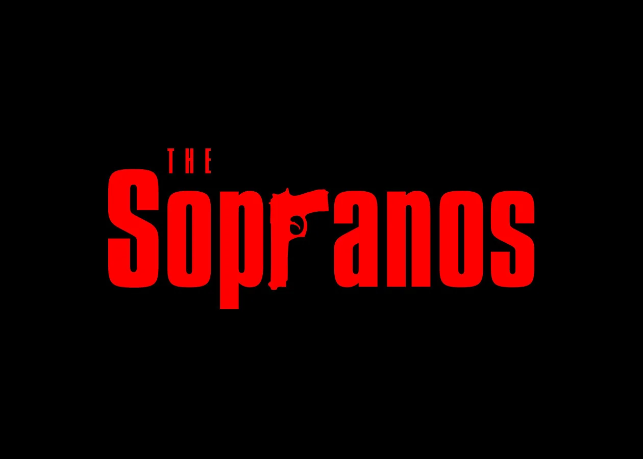
Simple substitution of a pistol for the 'r' has become a cultural icon. This has since been parodied by comedy programs such as 'The Simpsons,' and used in many look-alike logos.
This logo was created for a personal genetic profiling company. It is a fluid identity that changes both in color and in orientation of the lozenges. Different portions of the corporation can have their own logo while being integrated in a company-wide identity system. It is also malleable for both packaging and motion graphics.
Agency: MetaDesign
Creative Director: Matt Rolandson
Artwork for The Echo Chamber with Mike D
Client: Nine Inch Nails
Creative Director: John Crawford
Client: Apple
Agency: Leroy & Rose
Creative Director: Jon Manheim
Creative Director: Neil Kellerhouse
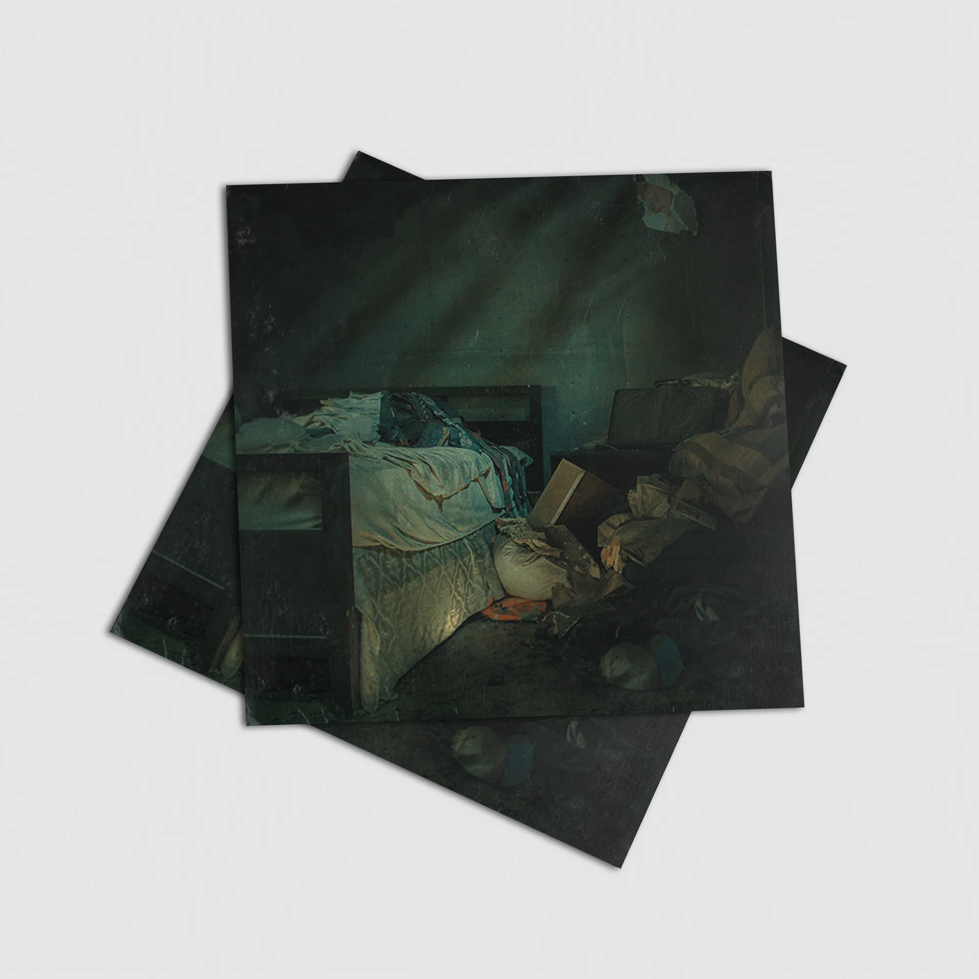
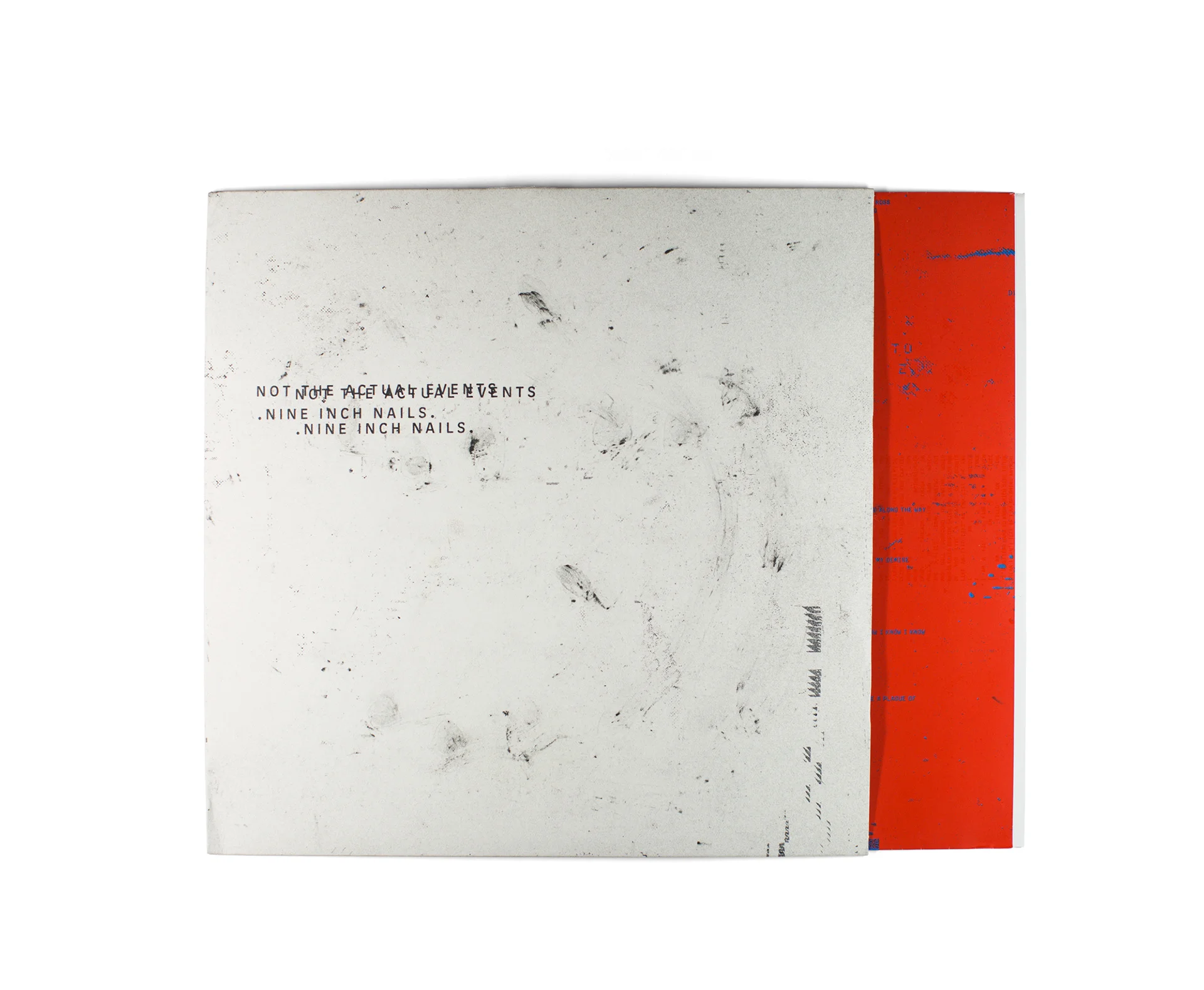
I was hired by Nine Inch Nails to help with design on the Not The Actual Events EP. This is a portion of the campaign referred to as the Physical Component. When you bought the high resolution FLAC version of the EP, a black envelope containing this would show up at your house at a later, undisclosed date. When the envelope was opened a set of lyrics cards were revealed that were covered with an unnamed black powder. This powder inevitably got on both the cards and the recipient creating a unique interaction with the artwork for everyone. To me the idea of the artwork leaving a messy and dirty mark on the user fit perfectly with the music and lyrics of the EP.
Creative/Visual Director: John Crawford [NIN]
Production: Jeff Anderson [Artist In Residence]
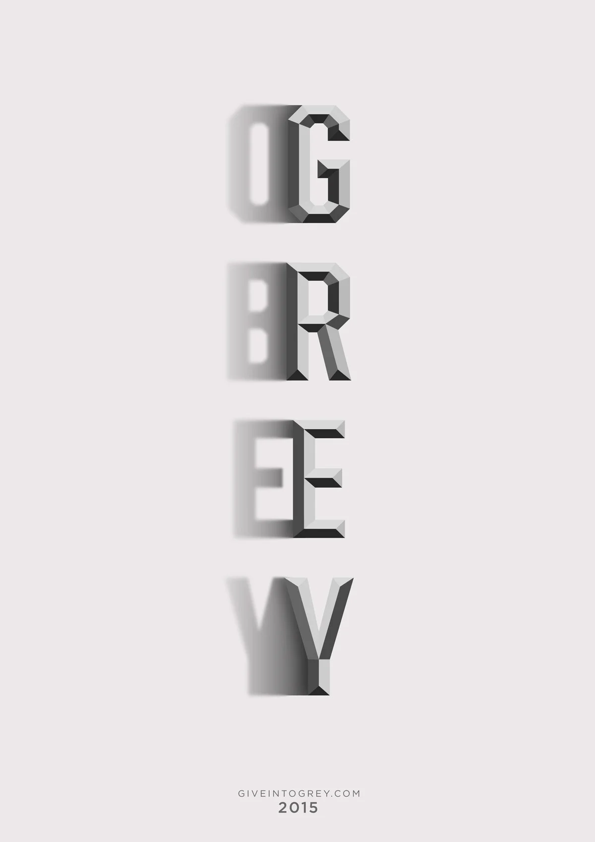
The following is a collection of logos I've made over the course of my career.
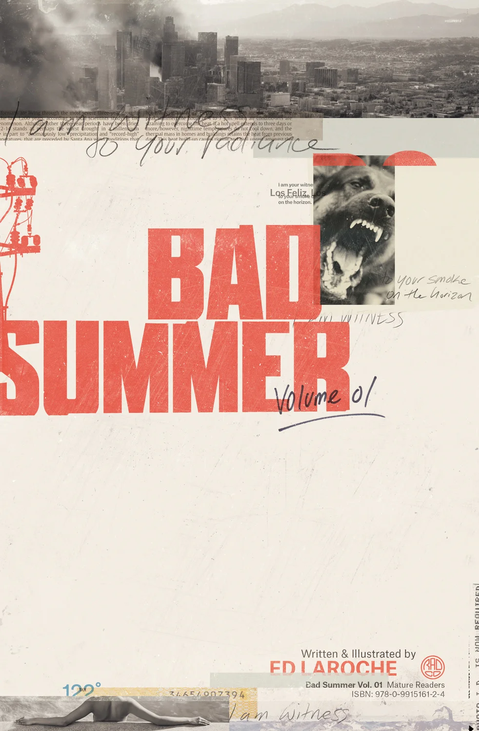
I was commissioned by Radco Comics to do the cover and interior spread for Ed LaRoche's Bad Summer. It's a story about Los Angeles during its worst heat wave — taking a city already on the brink, and pushing it over the edge.
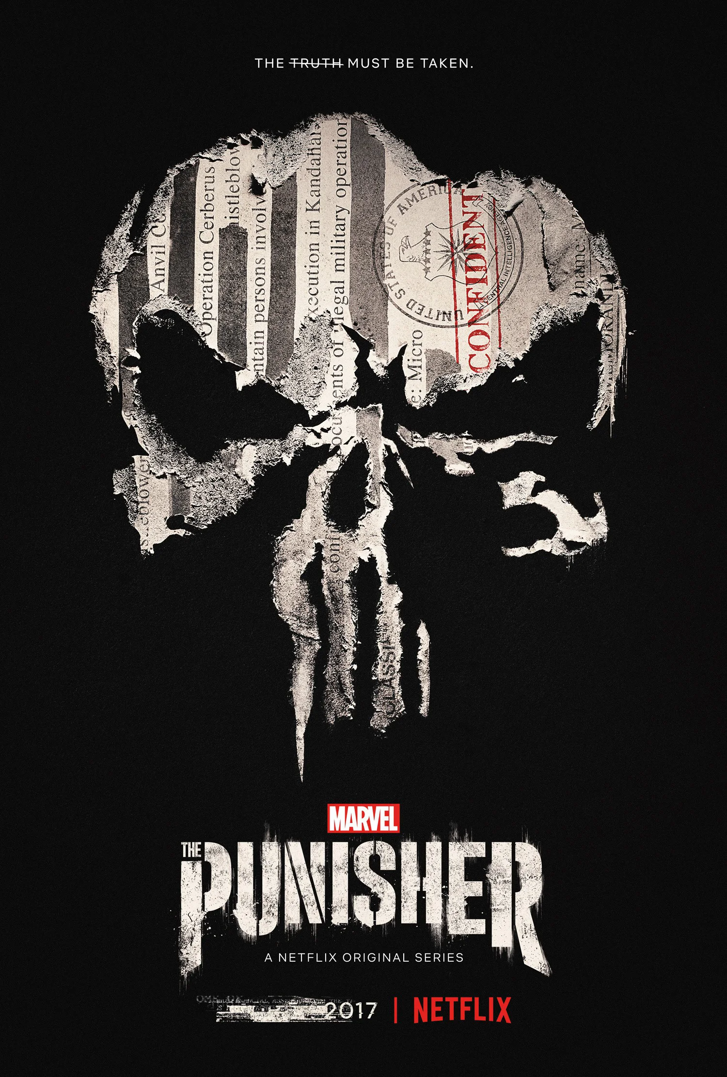
I was commissioned by Gravillis to concept and build comps for Marvel's The Punisher on Netflix. The logo was provided by the client. Although it is subtle, the redaction marks are meant to be reminiscent of the American flag, as the government and military are a cornerstone of the season.
Agency: Gravillis
Creative Director: Kenny Gravillis
Recorded on various fixed and modular analog gear during a particularly gloomy and rainy winter in Jamestown, Washington 2020.
Having worked over a month without a single day off from my primary occupation as a graphic designer, all of the days started blending together. This music was made as an escape and coping mechanism (something to help my mind pull focus), but ironically ends up being something well suited to listen to while working.
Written and recorded in off hours, piecemeal — the patch would be left on the modular for days, waiting to be picked back up again. By the nature of analog modular, when I would go back to it there were tiny differences. There’s always differences. And you can’t go back; what has been recorded is all there is, even with patch notes you can’t get back to where you were. So you just continue, find the pulse, find the pattern and let that guide the process. Sometimes it’s seamless, other times you can hear that a day or more has passed. Time became a theme for this recording as the entire release uses a time-offset composition technique where notes will play, the come back delayed at various rates, which end up creating countermelodies. So this mixture of what is now and what was then ends up weaving together into melodic strands held in place by a clock. Pattern exploration and manipulation — natural cycles of starting slowly then a flurry of activity all leading to the eventual wind down. The work is palindromic in its nature. Complexity emerging from simplicity, and collapsing back on itself, Ouroboros like.
Released March 2, 2020
Written, recorded and mixed by Corey Holms
Mastered by Nathan Moody at Obsidian Sound
Available from Bandcamp, Apple Music, Spotify and Amazon.
I was commissioned by musician Nathan Moody to design his A Shadow No Light Could Make album. The album is the soundtrack to a dreamscape, so the imagery ended up with a slightly surreal bent to it.
Exhausted Calm was recorded entirely on various fixed and modular analog synthesizers during the 2020 COVID lockdown in Jamestown, Washington. Increasingly bothered and overwhelmed by the 24/7 news onslaught, I stopped watching and reading all forms of news; this removal of constant, low-level dread and anxiety was followed by disengaging from social media for about half a year, adding to the pandemic's required physical isolation. It's like the feeling of relief to the period after experiencing an intense pain which finally subsides; all that is left is a low, throbbing, exhausted calm that completely takes over. This album is the exhausted calm of severing ties to the outside world for several months.
Written and recorded by Corey Holms
Produced, mixed and mastered by Nathan Moody at Obsidian Sound
Released December 01, 2020
Available from Bandcamp, Apple Music, Spotify and Amazon.
This is the poster for director Bryan Reisberg's feature length directorial debut at the 2014 SXSW Film Festival. The poster won the Audience Award for Excellence in Poster Design at the festival.
The domestic one sheet for the eOne film, Diana. The movie portrays the final two years of Diana's life.
I was very fortunate to have Timothy Saccenti ask me to do the typography for the Franz Ferdinand video, Love Illumination. The direction was to have something that looked like a dark carnival or playbill from some Faustian deal gone wrong.
Franz Ferdinand "Love Illumination"
2013
Domino Records
Production Company - Radical Media
Production Company - Able&Baker
Executive Producer - Joe Walker
Executive Producer - Jennifer Heath
Director - Timothy Saccenti
Director of Photography - Marc Gomez del Moral
Choreographer - Alexandra Reynolds
Art Director - Michelle Sothern
Costume Designer - Lotta Aspenberg
Editor - Ryan McKenna for The Mill
Colourist - Damien Vandercruz for The Mill
Flame - Russell Mack
Flame - Luc Job
Animation + VFX - Beautiful Jerk
Text Designer - Corey Holms
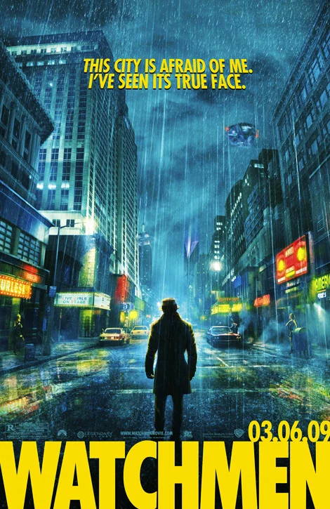
Posters for the movie adapted from the seminal comic book Watchmen. What I'm most proud of is it that I got to redraw Futura to match the photolettering version used in the comic book as it is no longer available.
This is a set of stencils that I created for FairGoods based on different typefaces that I have made. One of the typefaces has been released commercially, the other two have not.
I really like the idea of introducing a stencils into the market just at the point that they have absolutely no use or meaning anymore.
I was one of 40+ designers/illustrators given the task of creating their own interpretation of a cult, classic or obscure film poster from the past, whether it be a literal or abstract solution. The result is "Now Showing", an art exhibition paying homage to more than 70 years of film, through the form of prints, one-off screen prints and sculptures.
I was lucky to be paired with the magnificently talented Marian Bantjes who collaborated with me on the poster.
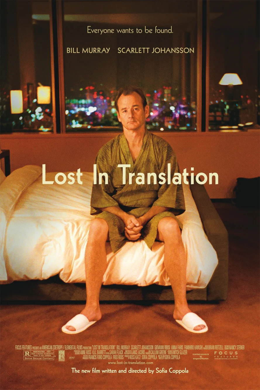
Poster for the movie Lost In Translation. The second one was done for a film festival, I can't find a copy with a real billing block, so I either lost the original or it wasn't used. I remember it being used, but cannot find the original artwork for the life of me.
Client: The Null Corporation
Creative Director: John Crawford
Design: Corey Holms
Client: The Null Corporation
Creative Director: John Crawford
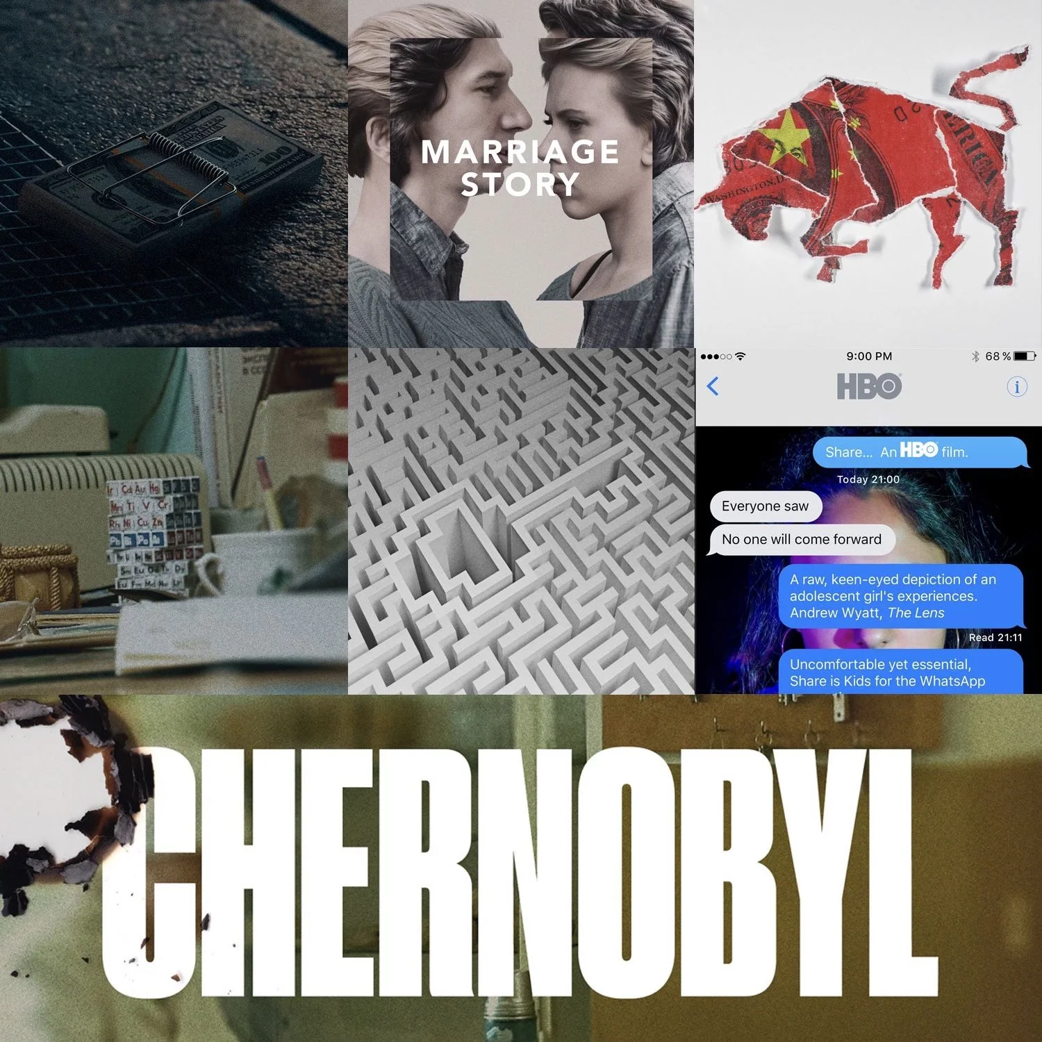
Entertainment design posters commissioned through various agencies including P+A, Kellerhouse, Leroy and Rose, Rhubarb and Gravillis — all were rejected by the client.
Creative Directors involved: Andrew Percival, Neil Kellerhouse, Jon Manheim, Ryan Jones and Kenny Gravillis.
This is how the logos looked when placed on the playlist graphic, which was designed by Mucho. I was very fortunate to be commissioned by Brett Wickens at Mucho to design two of the logos for the Apple Music playlist refresh.
The Late Innings: Arrived and Departed available via Bandcamp.
The Devil Wears Prada wanted a new logo, easily recognizable from a distance that would work well as a tattoo. The initial brief discussed creating a corporate type of mark, to "brand" them. This sparked the idea of making it a quite literally brand, so I took my cues from cattle brands.
Entertainment design posters commissioned through various agencies including P+A, and Gravillis — all were rejected by the client.
I was contracted by the entertainment design agency Leroy & Rose to make various logos for the Pixar movie Onward. One of the designs I made was chosen to be the movie's logo. The first is the version that I turned in.
The second is the rendered version that Leroy & Rose made that is used on all the promotional materials associated with the film. You can see that they made some adjustments to the letterforms, like moving the baseline of the D.
Agency: Leroy & Rose
Creative Director: Melchior Lamy
Client: The Null Corporation
Creative Director: John Crawford
Design: Corey Holms
Entertainment design posters commissioned through various agencies including P+A, Refinery, and Gravillis — all were rejected by the client.
The Deviations album by Nine Inch Nails, is a reimagining of The Fragile, where songs are reworked, remixed and made instrumental. It felt very appropriate then to recrop, and recontextualize the David Carson photography from The Fragile for the Deviations album to fit that theme. And importantly, it made sense to remove all text from an instrumental album, so there is no text on the jacket, or the sleeves at all.
Client: Nine Inch Nails
Creative Director: John Crawford
Photography and The Fragile Design: David Carson
Design: Corey Holms
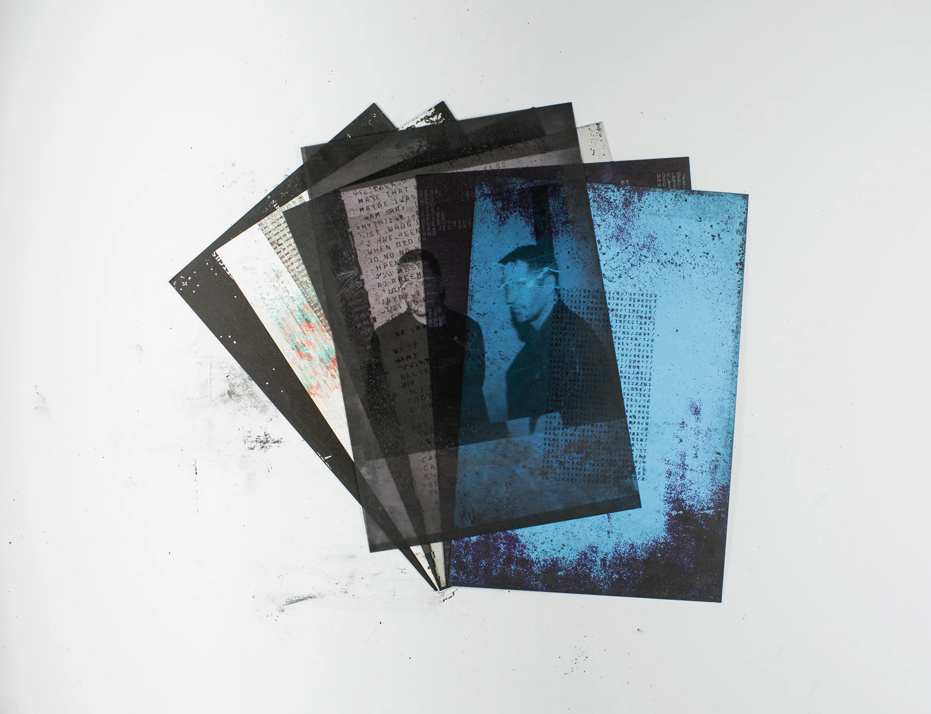
I was commissioned by musician Nathan Moody to design his Shades album, featuring a gorgeous illustration by Johan G. Winthers. The album was based around rituals, so the design took its cue from that.
The second image is the card that enshrouds the cassette box itself. I didn't want to spoil the cassette with any text (it is an instrumental album), so the cassette is wrapped in the text instead. Like a protective ward. The typeface is Roslindale, by David Johnathan Ross.
The third image is the front cover of the cassette, illustration by Johan G. Winthers.
The fourth image is the interior of the cassette sleeve, which features a color paint test by Johan, which I thought was extraordinarily beautiful, and wanted to feature in some way.
The final images are sigils that were used to replace the text used to designate which side of the album you're listening to. Again, since it's instrumental, we thought it better to just have some glyphs instead of text.
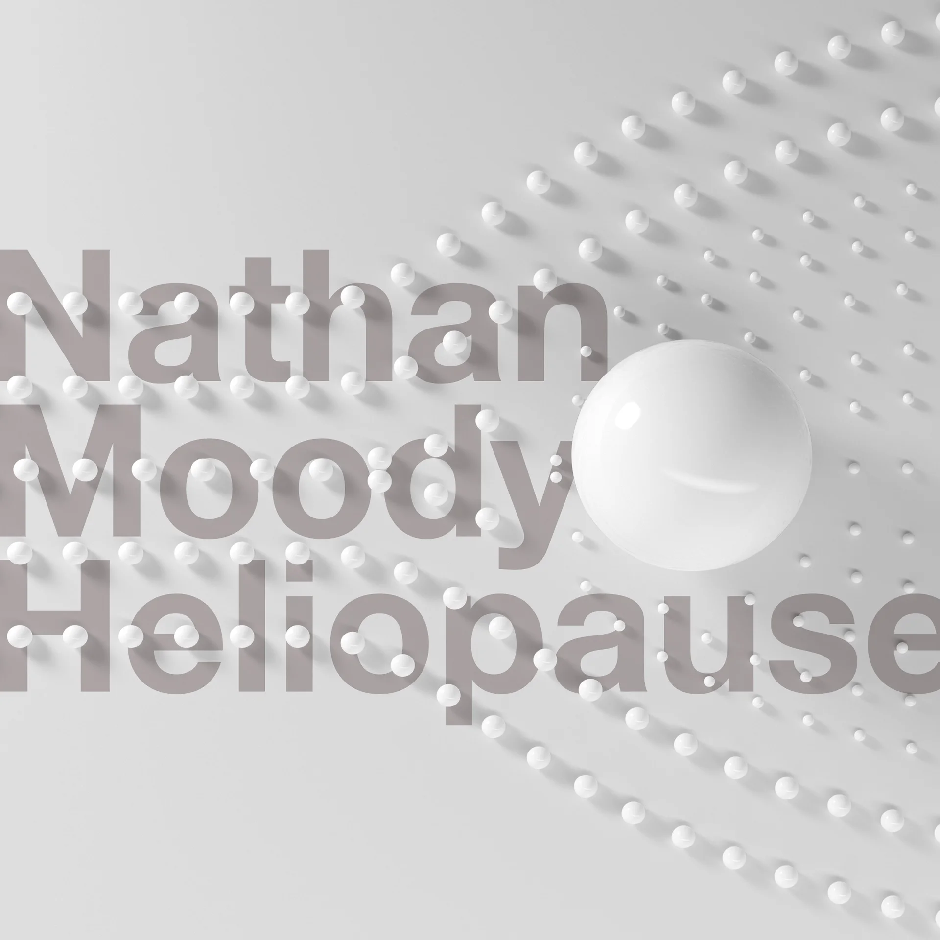
I was commissioned by musician Nathan Moody to create the artwork for his space music album Heliopause. The design abstractly explains how heliopause worked; but in the style of a minimal maquette in a museum.
You can buy the album via his Bandcamp page, it's a really stunning piece of work.
Written and recorded in Jamestown, Washington from January to March 2019. All spoken word material is sourced from public domain recordings. Copyright pertains only to these specific musical compositions.
The songs were all recorded using the Birdkids Bateleur 42hp System. The drums are a mixture of the Bateleur, ALM Akemie's Taiko and various other modular sources.
Released March 29, 2019
Available on Bandcamp
Written, recorded and mixed by Corey Holms
Mastered by Nathan Moody at Obsidian Sound
I was asked to contribute a piece of art for the "i Shout for The Fall"exhibition for the Design Manchester 2018 festival. The brief was to create a visualization of words by Mark E Smith. I chose the song C.R.E.E.P. from The Wonderful and Frightening World of The Fall.
To execute my idea, I used a Smith Corona Standard typewriter.
The Veneer Fades is my second release, available for free on Bandcamp.
Written and recorded in Jamestown, Washington from January to July 2018.
Released August 1, 2018
Written, recorded and mixed by Corey Holms
Mastered by Nathan Moody at Obsidian Sound
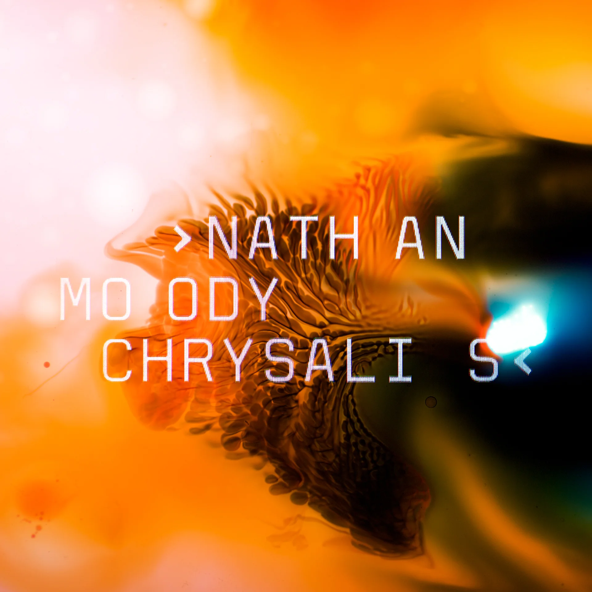
I was commissioned by musician Nathan Moody to create a cover for his album Chrysalis. The album is improvisational, recorded direct to computer over the course of two days, with no editing/overdubs. This specific release is digital only, so there are no other materials created to support the cover.
The artwork was created by photographing a mixture of food dyes, mineral oil and water. While the typography was photographed directly off the monitor, to give a counterpoint to the soft nature of the art.
Written and recorded in Jamestown, Washington from May to December 2017. All of these songs were originally written as one minute songs uploaded to Instagram; the best of that period were chosen and expanded for this EP.
Released January 5, 2018
Available for free on Bandcamp.
Written, recorded and mixed by Corey Holms
Mastered by Nathan Moody
I was asked by Brett Wickens to co-design this remake of Malcom Garrett's classic Buzzcocks sleeve with him. This artwork was shown at the Orgasm Addict Reframed show, during Design Week Manchester.
Creative Director: Brett Wickens
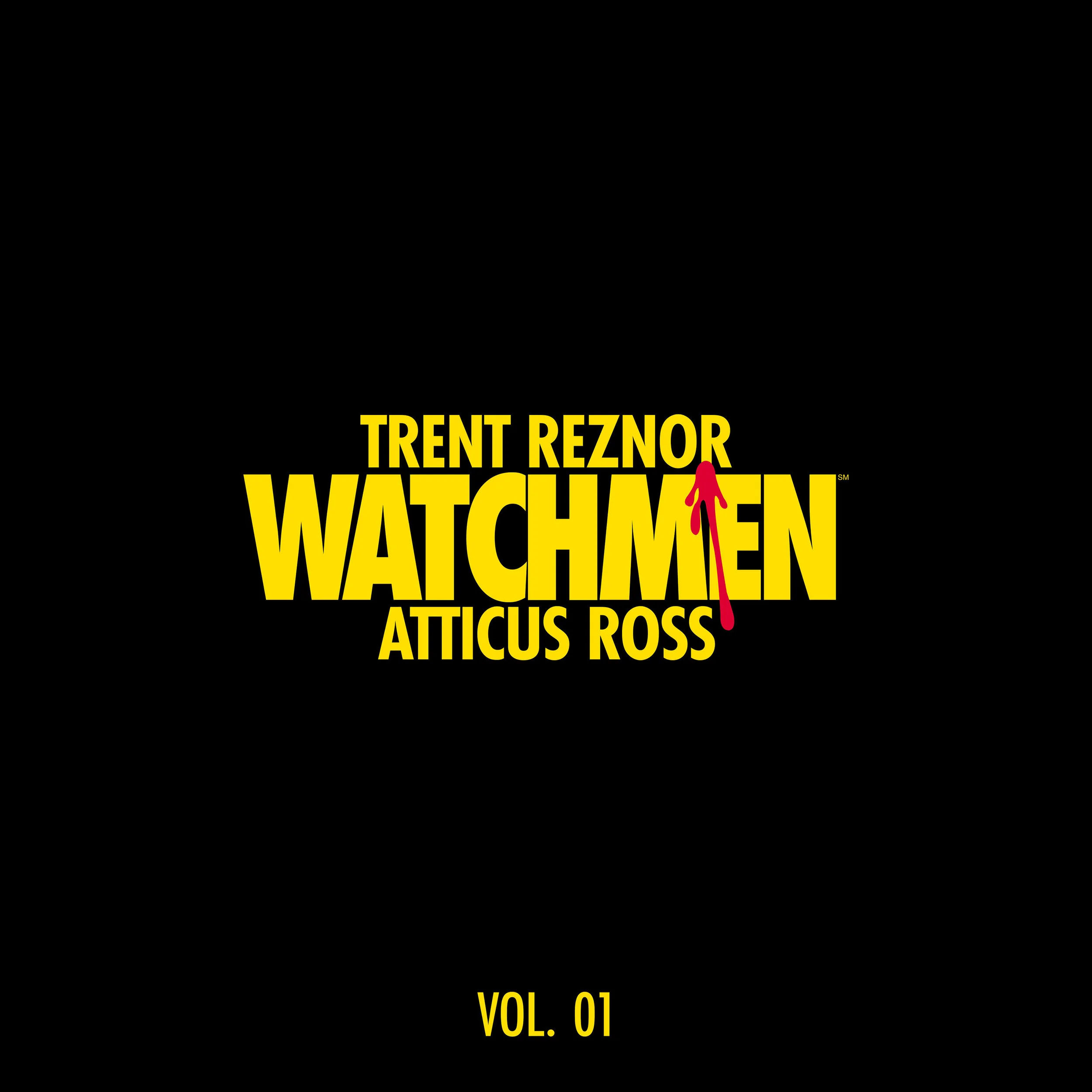
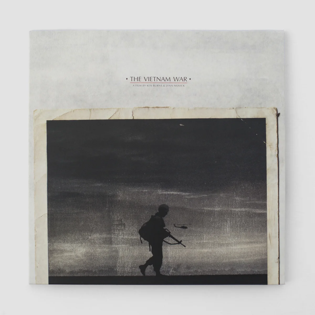
Album design for the Trent Reznor & Atticus Ross soundtrack of the Ken Burns Vietnam War documentary.
Client: Trent Reznor
Creative Director: John Crawford
Design: Corey Holms
Typeface: Pitch by Kris Sowersby at Klim
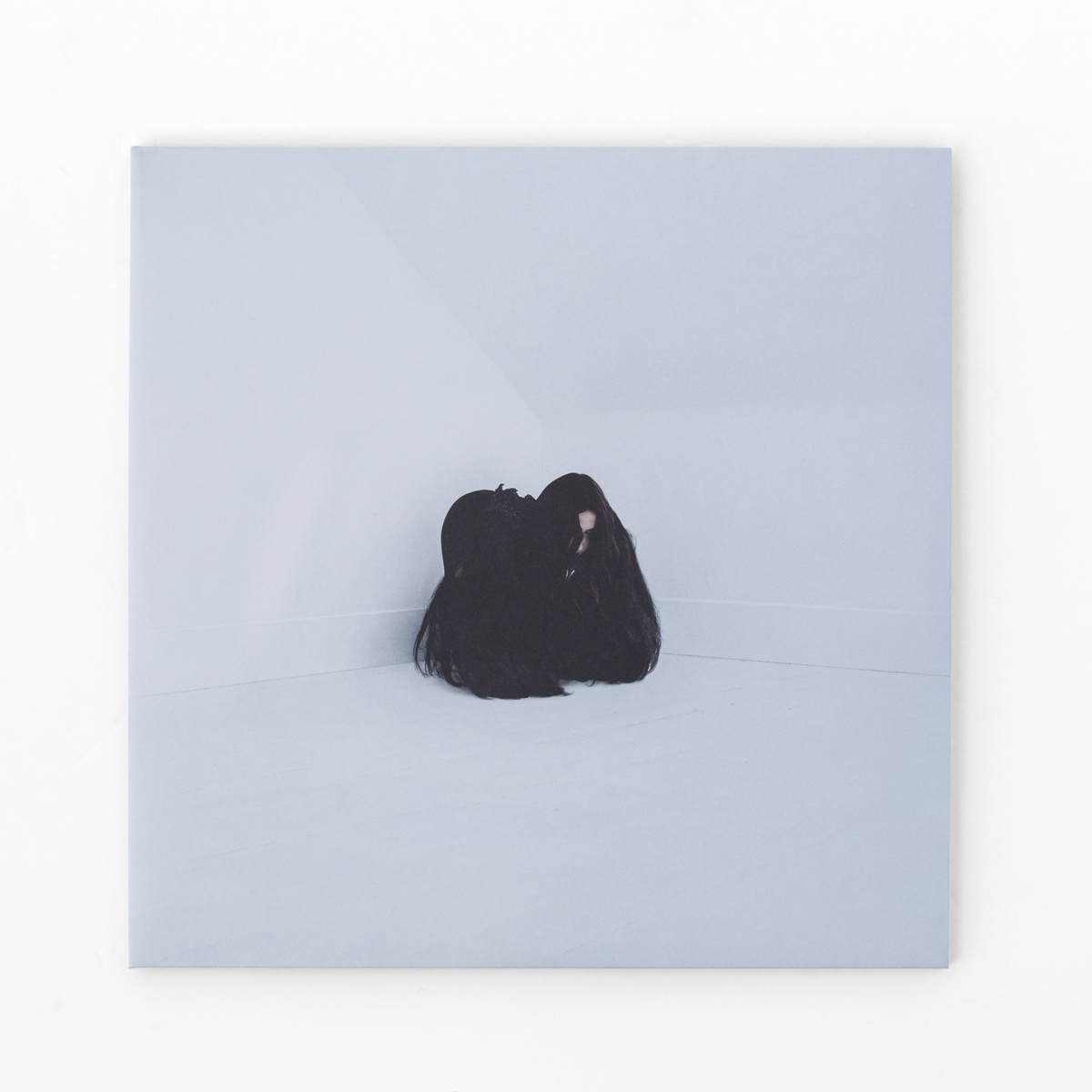
I was incredibly fortunate to be asked to do the typography for the Chelsea Wolfe album "Hiss Spun".
Art Direction: John Crawford
Photography and Hair Typography: Bill Crisafi
Collage: Muted Fawn
Typography: Corey Holms
Typeface is Magpie by Vincent Connare via Typekit.
Nine Inch Nails : Not The Actual Events Vinyl EP
Each cover is given a variable amount of black powder that intermingles with the artwork, blurring what is printed and what is smudged. It also allows for each recipient to have a unique piece of art.
There is a varnish on the sleeve that when looked at in the light, allows the viewer to see alternate text messages.
Client: Nine Inch Nails
Creative Director: John Crawford
Design: Corey Holms
Poster and Billboard for the Spike Jonze movie reinterpretation of Maurice Sendak's book.
Various projects for various shops including P+A, Gravillis, and BusterINK — all were rejected by the client.
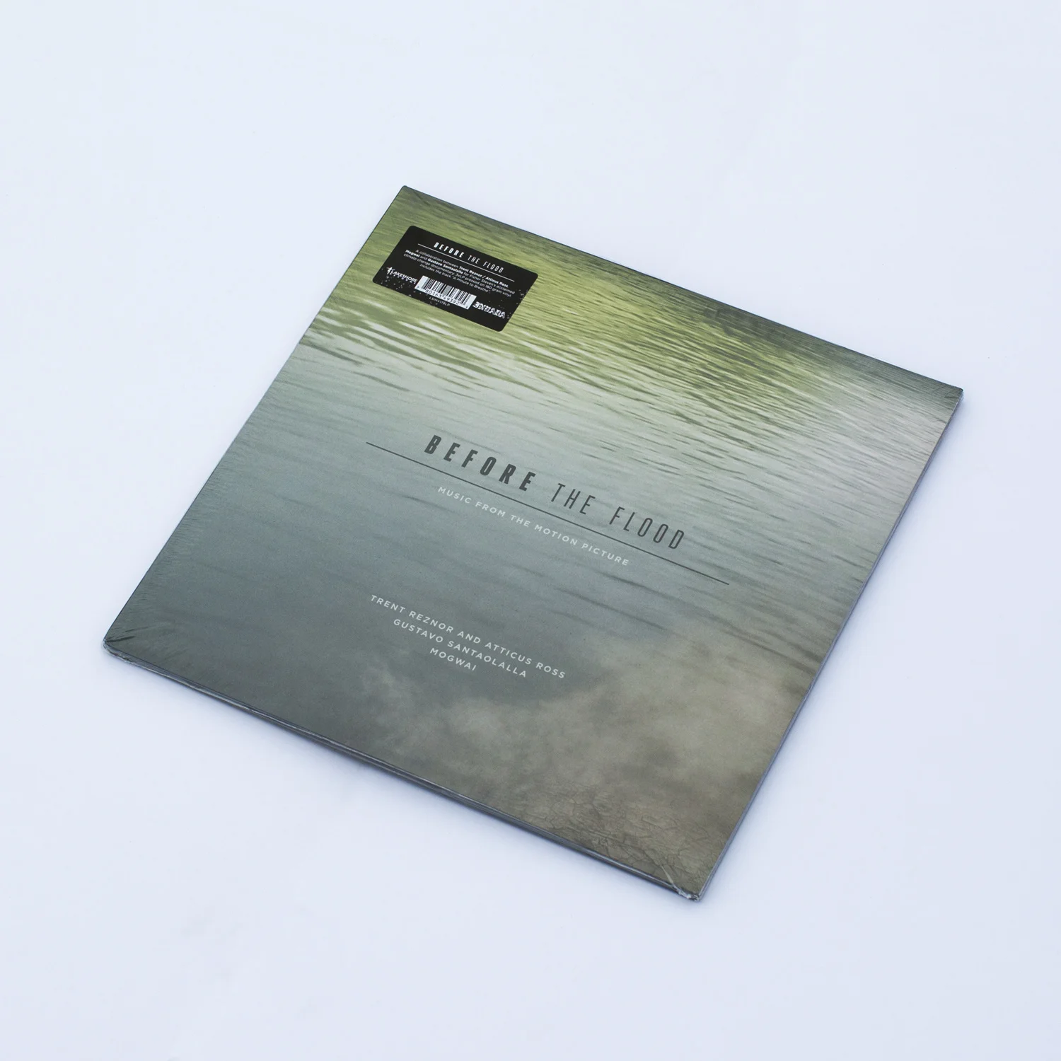
I was hired to design the Before The Flood soundtrack by Trent Reznor and Atticus Ross, Gustavo Santaolalla and Mogwai. The photography was provided by NASA from the Images of Change collection.
Client: Trent Reznor
Art Director: John Crawford
I was hired by Gravillis, Inc. to do an illustration for the HBO show Westworld. The first image is what I turned in, and the second is the final poster that they made using my illustration.
Here are some additional elements and alternate ideas I made. The snake was used in the final poster.
This award was presented to Fred Smeijers for Lifetime Achievement for his contributions to the field of Typography on August 26, 2016 at TypeCon 2015: Resound in Seattle, WA. I originally created the file in Cinema 4D, rendered out some mockups, which was sent to Nathan Tremblay who manufactured the physical award. The photography was done by Grant Hutchinson and Peter Bella.
This is the logomark I designed for Story Machine, Ben Ketai's company for young film makers.
Agency: Filmograph
Creative Director: Aaron Becker
Various projects for various shops including P+A, Gravillis, and The Refinery — all were rejected by the client.
Various projects for various shops including P+A, Gravillis, Leroy & Rose, Palaceworks, and Canyon — all were rejected by the client.
This award was presented to Robert Slimbach for Lifetime Achievement for his contributions to the field of Typography on August 15, 2015 at TypeCon 2015: Condensed in Denver, CO. I originally created the file in Cinema 4D, rendered out some mockups, which was sent to Nathan Tremblay who manufactured the physical award.
The photography was done by Grant Hutchinson
I was commissioned by Gravillis to produce several posters for the movie 50 Shades of Grey.
Agency: Gravillis
Creative Director: Kenny Gravillis
I was commissioned by Gravillis to produce posters for the Ridley Scott movie, Exodus. The first couple posters were done in camera with detritus that I found in the reservoir next to my house. Very little Photoshopping was done, mostly color correction — except for the flies one. That was Photoshopped because it was too cold and there were no flies to be caught. The second set are the chronological number of the plague, but the number is made up of the plague item (frog, locust, etc.).
Agency: Gravillis
Creative Director: Kenny Gravillis
Various projects for various shops including P+A, The Refinery, Silas, and Canyon — all were rejected by the client.
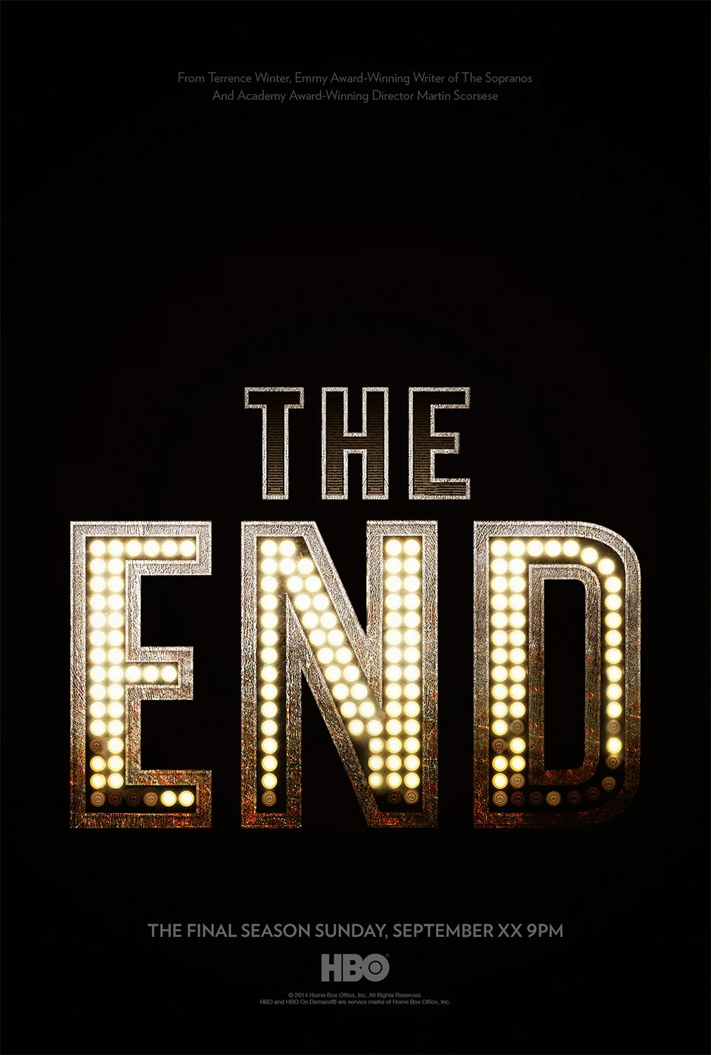
I was commissioned by Canyon to produce posters for the final season of HBO's Boardwalk Empire.
Agency: Canyon
Creative Director: Jack Cheng
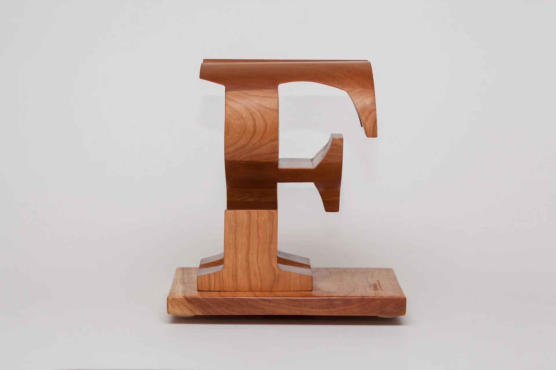
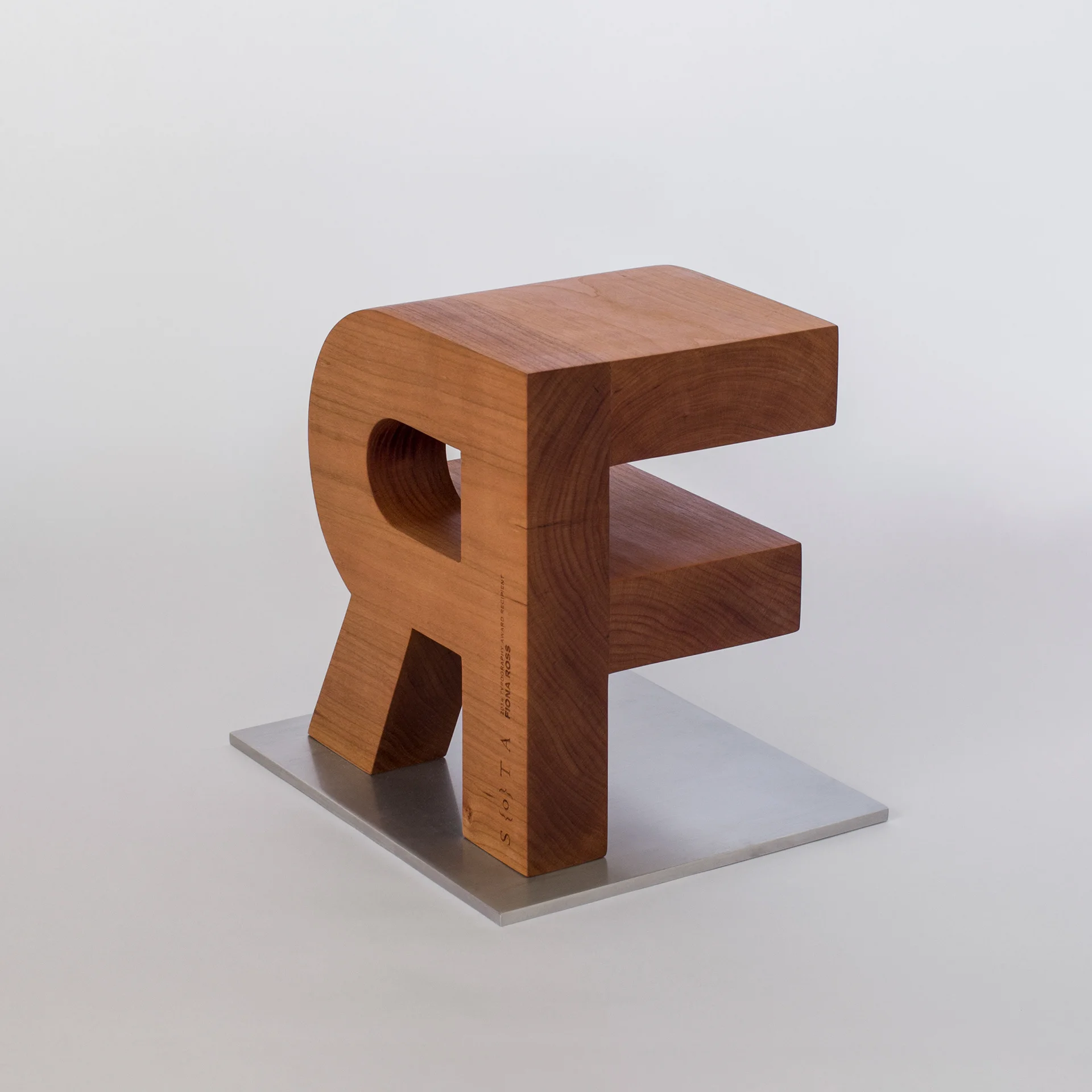
This award was presented to Fiona Ross for Lifetime Achievement for her contributions to the field of Typography on August 2, 2014 at TypeCon 2014: Capitolized in Washington, D.C.
I originally created the file in Cinema 4D, rendered out some mockups, which were passed around to the award committee for approval. Upon approval, I contacted Xerxes Irani at FairGoods to produce the award in wood. He found Nathan Tremblay who ended up making the physical award.
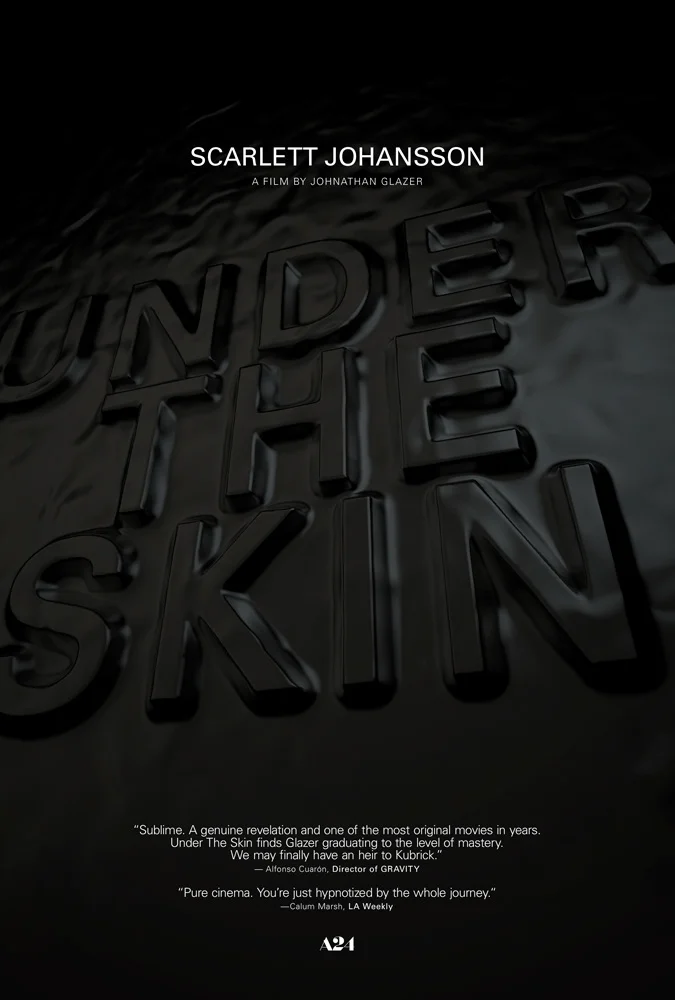
Commissioned by P+A to make posters for a film festival showing of Under The Skin. The typeface used in all of the posters is Univers.
Agency: P+A
Creative Director: Andrew Percival
This is the poster for the 2014 SXSW premiere of the film Wild Canaries by Lawrence Levine. It's a farcical story about a couple that fall out of and back into love, over the course of an inept detective adventure.
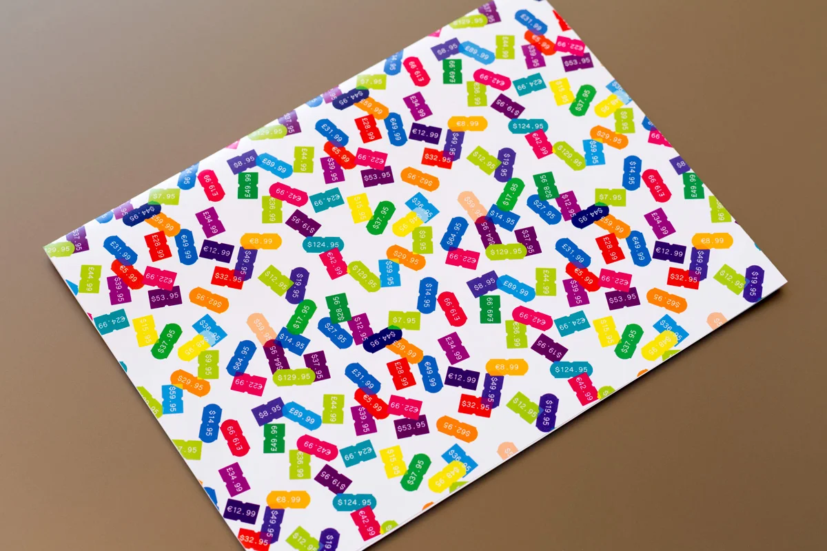
This is a custom, all purpose wrapping paper designed for FairGoods.
This is a personal project I did where I put regular grocery store food dye into water and sometimes oil and photographed the results.
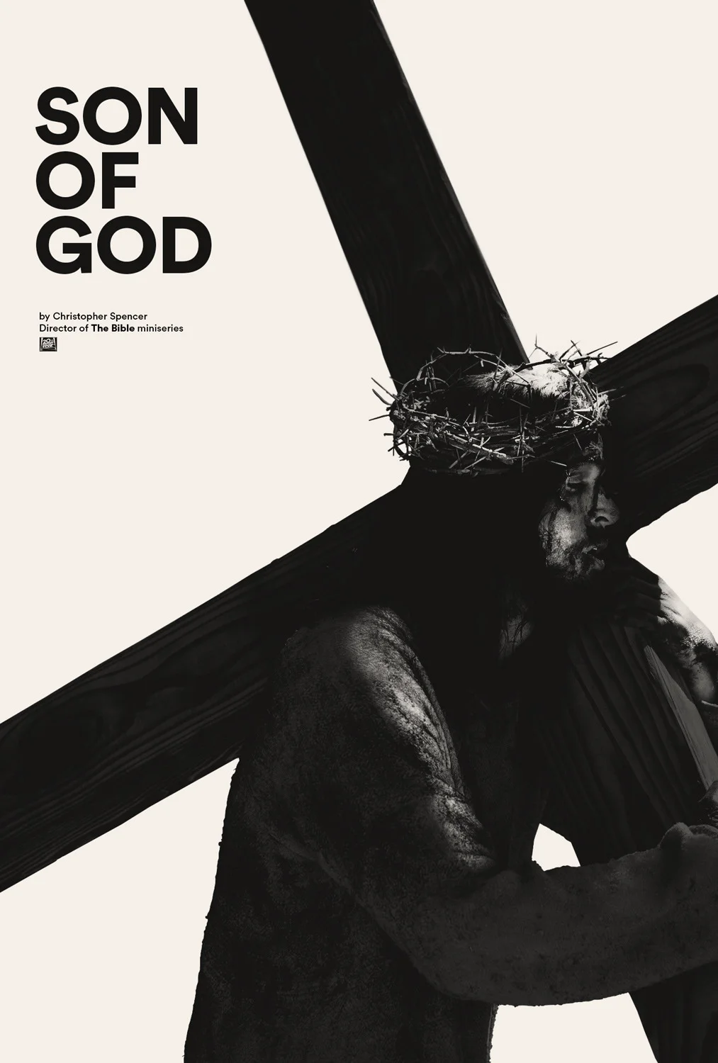
Key art design for the motion picture "Son Of God".
Agency: Gravillis
Creative Director: Kenny Gravillis
This is a collection of rejected work, in no order and no implied judgment — just stuff that never made it for a multitude of reasons. These were created at a variety of shops by myself, but working for other people. Agencies include Crew, Mojo, Cimarron and The Refinery.
This is a collection of rejected work, in no order and no implied judgment — just stuff that never made it for a multitude of reasons. These were created at a variety of shops by myself, but working for other people. Agencies include Crew, Mojo, and Cimarron.
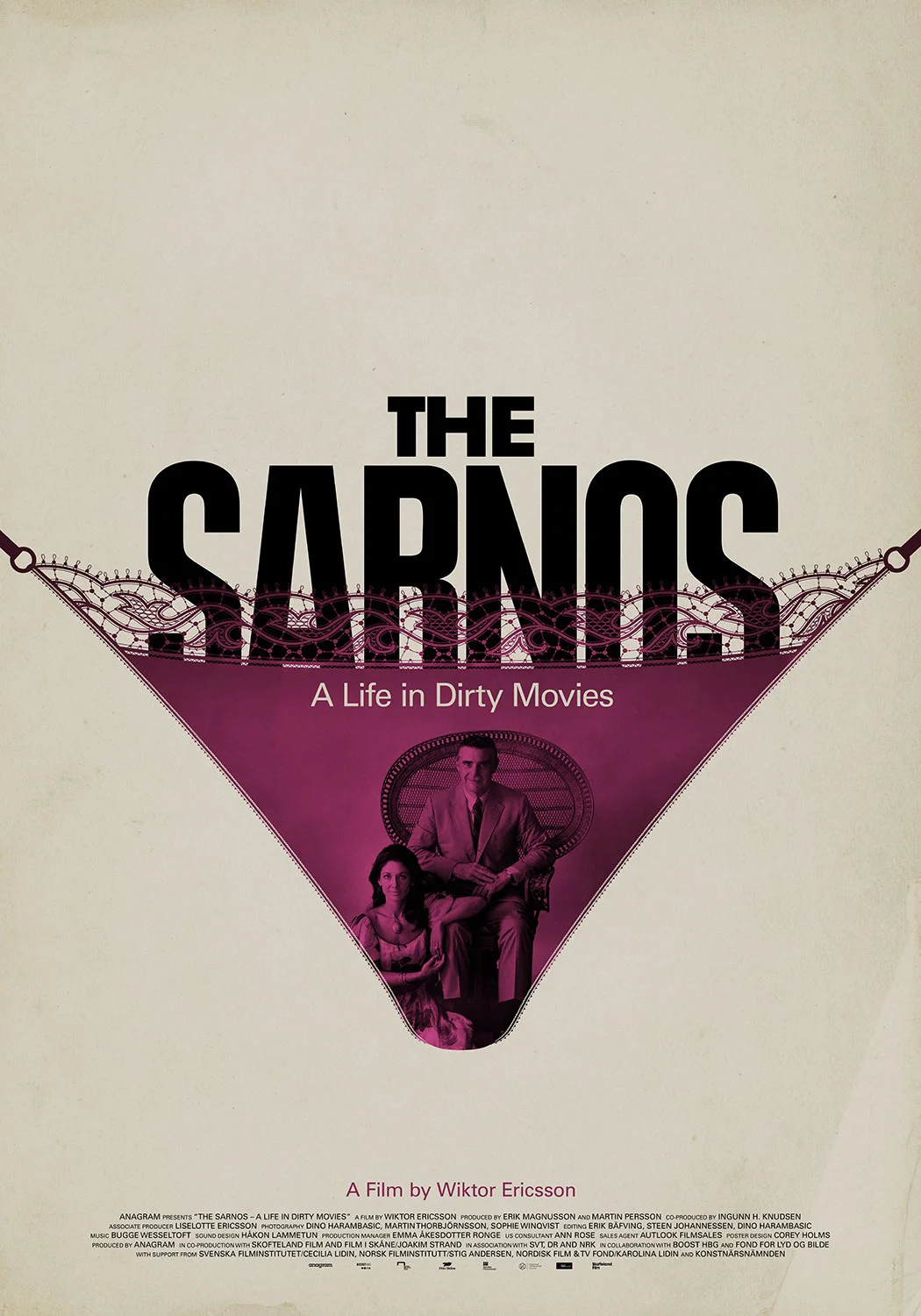
A poster for the film The Sarnos: A Life In Dirty Movies by Wiktor Ericsson. It is documentary about the life and work of married couple Joseph and Peggy Sarno, who made sexploitation films popular in the 60s and 70s.
Design for an annual CD compilation titled Stolen Music (for a group CD club of 13 members). Each cover of the yellow and grey compilation was specifically designed for one of the members, That one was for Adam Faja.
This is an aluminum stencil created from my typeface Ne10. Several of the letters had to be modified so that they would be strong enough to support the metal frame. Although when creating a typeface for digital use, when it is applied physically certain aesthetic choices need to be replaced with practical ones. That was an interesting lesson to learn in the prototyping phase of this project.
I was fortunate to be one of the designers commissioned by Adrian Shaughnessy to remix the logo for the Depeche Mode album Sounds Of The Universe.
Embroidery by Formfire Glassworks
This stencil font takes its inspiration from a neon sign at my local pizzeria without being blatant in its reference. This monoline sans-serif face works in both large and small scales, making it versatile at bridging the gap between corporate and urban communication.
Available from Canada Type.
I designed the logomark to represent both halves of the company's name. The fighting part is represented by an abstract fist, while the records part is represented by an abstracted soundwave.
The teaser poster for the movie The Sixth Sense by M. Night Shyamalan. This poster won a Key Art Award in the year 2000.
Agency: Frankfurt Balkind
Creative Director: Peter Bemis
The company I worked for, Logan, was asked to design the Spectacle Music Video exhibition for the CAC Museum. I got to do the logo and limited edition posters for the exhibit.